
2026 Wedding Colour Palettes Worth Actually Saving (Not the Blush and Sage Ones)
If you've spent more than ten minutes on Pinterest lately, you already know the problem. The same dusty rose table. The same eucalyptus runner. The same blush bridesmaids in a paddock somewhere.
It's not that those palettes are bad. It's that they've stopped meaning anything.
For couples planning 2026 weddings right now — and I work with a lot of them here in Melbourne — the question I keep hearing is some version of: "How do we make it feel like us, and not like everyone else's wedding from the last three years?"
The answer, more often than not, starts with colour.
Why Your Colour Palette Matters More Than You Think
Your colour palette isn't just a mood board decision. It's the thread that runs through everything — your florals, your linens, your stationery, your lighting, your bridesmaids, your cake. Get it right and your wedding has a coherent visual identity. Get it wrong — or just default to whatever's everywhere on Instagram — and no amount of beautiful individual elements will make it feel cohesive.
As a florist, colour is where I start every single client conversation. Not flowers. Colour. Because flowers are just the vehicle. Colour is the feeling.
So I've done what I do every year: I've tracked what's moving through the fashion runways, interior design trends and the real weddings I'm seeing come through — and I've pulled the four palettes I think are genuinely worth your attention for 2026.
These aren't predictions. They're already here.
The 2026 Wedding Colour Palettes to Know
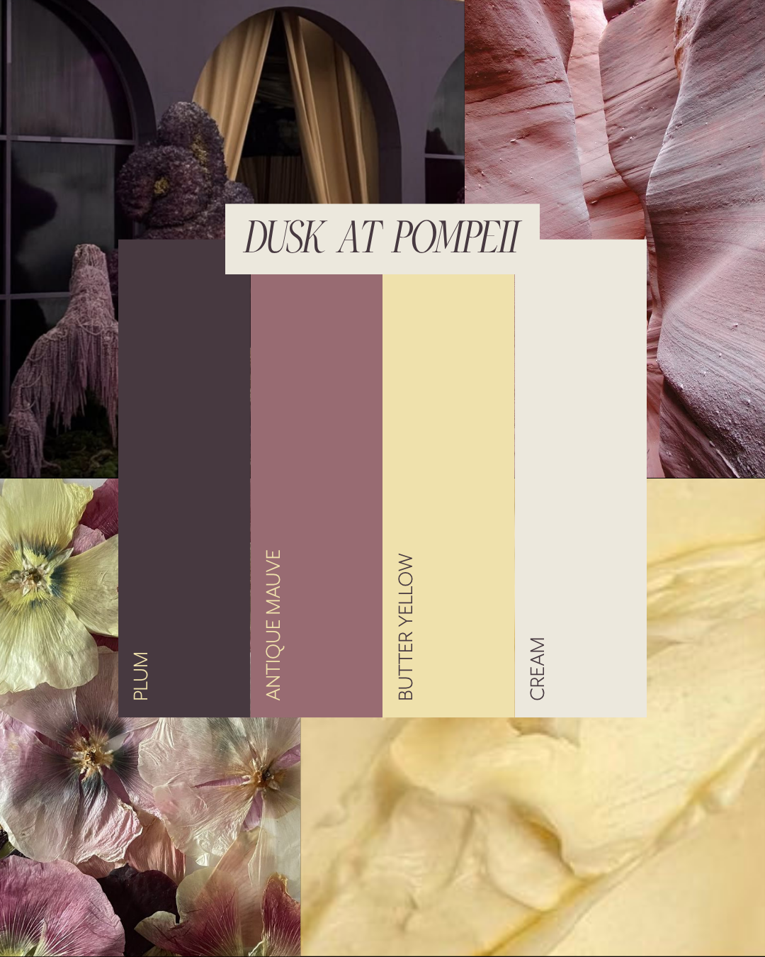
1. Dusk at Pompeii
Plum · Antique Mauve · Butter Yellow · Cream
This is the palette for couples who want their wedding to feel like it belongs in an art museum. Rich and ancient and a little bit dramatic — but never overdone.
The combination of plum and butter yellow shouldn't work on paper, but it absolutely does. The yellow keeps the plum from feeling heavy; the plum keeps the yellow from feeling sweet. Antique mauve bridges the two beautifully, and cream grounds the whole thing.
Best suited to: Heritage venues, garden receptions, winery weddings. Particularly beautiful for autumn and winter celebrations in Melbourne.
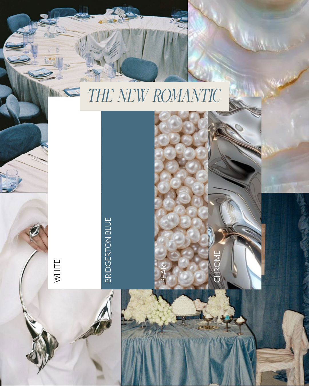
2. The New Romantic
Bridgerton Blue · Pearl · Chrome · White
This one is for the couple who loves classic romance but wants it to feel current. The steel and chrome element is what makes it — without that, you're in Cinderella territory. With it, you're somewhere much more interesting.
Bridgerton Blue is having a significant moment right now — it appeared across fashion and interior design simultaneously this year, which is always a signal that it has legs. Paired with the iridescent quality of pearl and the cool modernity of chrome, this palette feels luxurious without being fussy.
Best suited to: Ballrooms, contemporary venues, rooftop or urban receptions. Strong for spring and early summer.
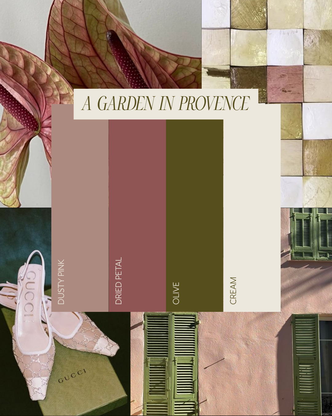
3. A Garden in Provence
Dusty Pink · Dried Petal · Olive · Cream
This is the grown up version of blush and sage.
If you want warmth, texture and a sense of effortless European elegance, this is your palette. It's the one that feels like long lunches and afternoon light and linen tablecloths — the kind of wedding that looks like it wasn't trying too hard, even though every detail was considered.
Olive is doing a lot of heavy lifting here. It's sophisticated in a way that sage never quite was — darker, more complex, more directional. Paired with the warm rose tones of dusty pink and dried petal, it creates something that feels genuinely Mediterranean without veering into theme territory.
Best suited to: Garden venues, estate or property weddings, relaxed outdoor receptions. Perfect for Melbourne's spring season.
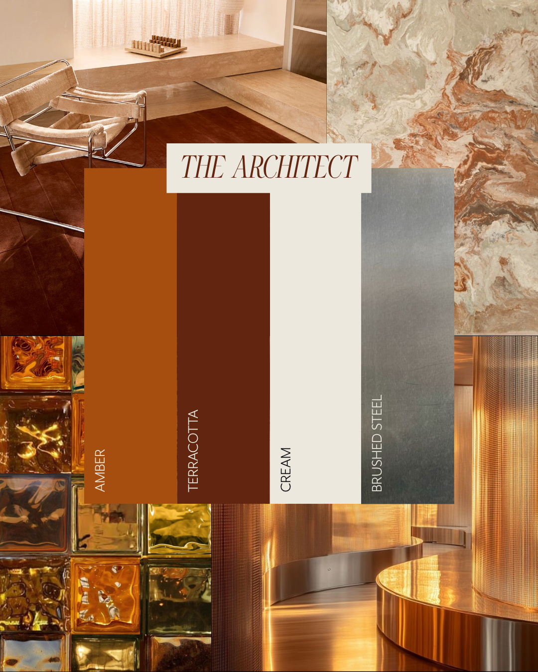
4. The Architect
Amber · Terracotta · Cream · Brushed Steel
This is the most unexpected palette of the four, and my personal favourite for 2026. It takes the earthy warmth that's been building across interior design for the past two years and adds an industrial edge that makes it feel completely fresh.
The brushed steel is the detail that separates this from every other terracotta wedding you've seen. It signals that the couple has a design sensibility — that they're thinking about their wedding the way an interior designer thinks about a space. Which, frankly, is exactly how the best weddings are planned.
Best suited to: Industrial venues, converted warehouses, contemporary art spaces. Stunning year-round but particularly strong for autumn.
How to Use These Palettes
A few things I tell every client:
Trends are a starting point, not a brief. These palettes are directional — they tell you where the broader design world is heading. But your wedding should reflect you, not a forecast. Use these as a jumping-off point and then pull in the details that are specific to your relationship, your venue, your story.
Think in ratios. A colour palette isn't equal parts everything. Usually you want one dominant colour (60%), one secondary (30%), and one accent (10%). Decide which of your palette colours plays which role before you start making any decisions.
Your florist should be your first call, not your last. Colour in florals behaves differently to colour on a screen. What looks perfect on a mood board can shift significantly depending on the light at your venue, the time of day, and the specific varieties available in season. This is the conversation to have early.
Ready to Talk Colour?
If any of these palettes sparked something for you, I'd love to hear about it. Botanical Quarter works with couples across Melbourne and surrounds — from intimate garden ceremonies to full-scale productions — and the colour conversation is always where the best weddings begin.
Botanical Quarter is a Melbourne-based wedding and event florist offering full-service floral design, on-the-day stationery and styling for modern, luscious and romantic weddings.